Friday, April 22, 2011
This Week
I was in Kahneeta on Monday. I came to school on Wednesday. We started our animal collages. On Wednesday, I made a blue background and on Friday I put a brown cow face on it. Then, I painted 'MOO' on it twice in red letters. It is almost done. I've been gone for a while so I have some stuff to catch up on still.
Friday, March 4, 2011
Week 7
This week I finished up my seascape, watched a German art film, and got to see everyone else's seascapes. We are officially done with watercolor. Mostly, I think I just gained experience. It was good for me to use a variety of brushes and experiment with mixing colors. My technique is still lacking, but I think that is just a patience issue. WIth my seascape I tried to apply large blocks of colors with sharp edges. Stylistically, I'm really happy, but I don't like how my color blocks overlap and look sloppy. I might try experimenting with masking fluid.
Tuesday, February 22, 2011
Week Five:
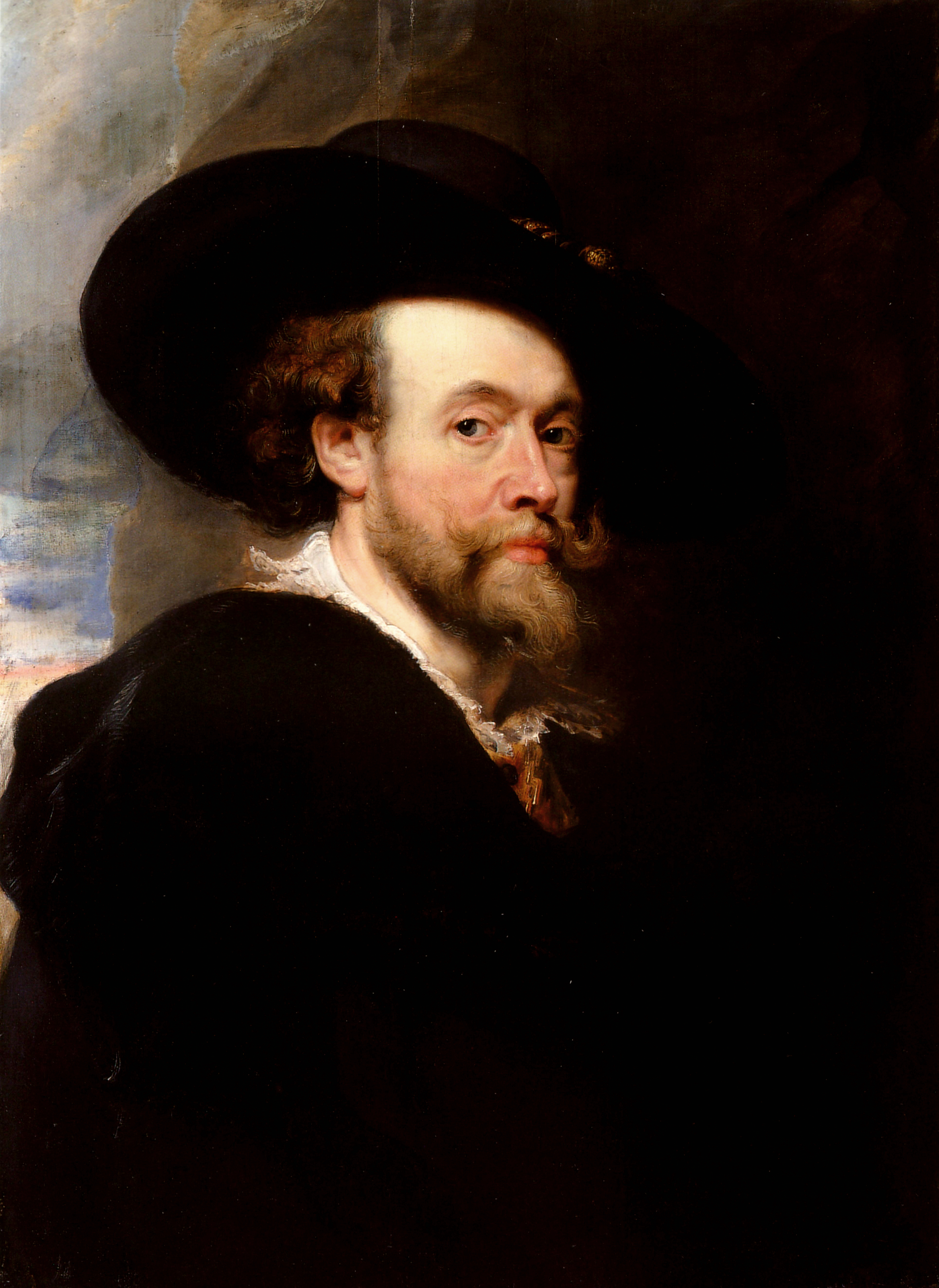
This last week I did a report on Peter Paul Rubens. I learned that he is the source of the word rubenesque, which is used to describe large women and that he was very a very influential Flemish painter. He had his own studio where he taught art and was financially successful. I finished my self portrait and was pleased with the result. I think it looks like me. I tried hard to be accurate and to draw carefully. It was good experience in the water color medium.
Wednesday, February 16, 2011
Baroque Art- Peter Paul Rubens
Ryan Robinson
Integrated Art 6th
16 February 2011
Baroque Artist Paper
Peter Paul Rubens
Peter Paul Rubens was a painter from the Netherlands during the 1600’s. People from the Netherlands are called Flemish. So we call Peter Paul Rubens a Flemish painter. He was born in 1577 in a region of Germany called Westphalia. The next year, his family moved to a different German city called Cologne. There, Peter’s father died when Peter was only twelve. Then, he moved with his mother to Antwerp, in Belgium. His early childhood was heavily influenced by the Catholic church, which probably inspired the subject matter of his paintings. During his teenage years, however, he became educated in Humanist and Classical principles. At 14 years old, he apprenticed under a man named Tobias Verhaeght. He spent a lot of time copying other famous paintings by artists such as Adam van Noort and Otto van Veen until he finished his education in 1598. He painted for eight years in Italy, then moved back to Antwerp when he heard that his mother was getting sick. There he set up a successful studio. Anthony Van Dyck was one of his pupils. Peter was also a diplomat, so he was able to travel extensively throughout Europe during his career. In the 1620’s he painted a large piece for the queen mother of France and spent a lot of time traveling between Spain and England. He spent the last decade of his life painting in Antwerp, where he died of gout in 1640.
Rubens received commissions mostly for religious subjects as part of the Catholic counter-reformation. He painted mostly portraits, but did a few landscapes later on in life. His work is very realistic and detailed. He is exemplary of the extravagant Baroque style. According to Wikipedia, he painted so many large women that the term Rubenesque now is used to describe large women. He had a large influence on the Flemish painting style in the 1600’s. Many Flemish painters trained in his studio.
Rubens is considered to be part of the Baroque period, because the time period in which he was active is referred to as Baroque. Baroque art is said to be more dramatic than renaissance art. Baroque art is detailed and grand. Ruben’s art is described well by these words.
Rubens was important in the development of Baroque painting in the Netherlands. Without his work, art might never have gotten past the Renaissance. I cannot point to any modern examples where the correlation between Ruben’s art and the modern piece is apparent, but I believe that the Baroque period was a step that art had to take. It was reflective of the cultural climate and the social norms of the day.
I appreciate the level of detail Rubens put into his paintings, but I don’t like his work very much at all. It’s too busy for me. I think baroque art is too uptight and stiff. His portraits are so haunting. But, I do realize that it was a necessary step in the development of Western Culture. I’m just glad that we’ve moved past it.


Wednesday, February 2, 2011
Symbolic Colors
White: thoughtful, forever, heaven, death
Black: solitude, thickness, isolation, dense
Grey/Brown: relaxed, pliable, unassuming, patient
Yellow: angst, ugly, hesitant, self-deceiving
Orange: movement, curves, concise, quick
Red: control, vigor, assert, whim
Green: newness, freedom, pushing, energy
Blue: sad, waiting, deep, foggy
Violet: night-time, longing, slow, graceful
Friday, January 21, 2011
Week One: What I learned
I can't remember what happened on Monday. On Wednesday, we watched a watercolour tutorial. I learned how to use masking fluid. I think this would be helpful, because I don't yet have much control over the brush. It would have been helpful when I was trying to paint the green bottles in the art room. It looks very sloppy to me. I need to be more patient with the brush.
Sunday, December 19, 2010
Recycled Project
1. I made a wallet out of plastic bags.
2. I flattened out plastic grocery bags, placed them in a stack four high, giving eight layers of plastic, and ironed them between two pieces of paper. The plastic melted and the bags bonded to form one piece of "fabric." I cut and folded the plastic into the form of a wallet, and ironed again to bond the seams.
3. I used plastic bags, paper, and an iron.
4. I was interested in seeing how usable the plastic fabric was and whether or not it was easy to make.
5. One funny thing about the process was during the ironing. The paper I used did not entirely cover the plastic, so i let the handles hang out and did not iron them. The ironing caused the plastic to shrink, and so did the handles. They got pulled beneath the paper. It appeared as if the bag were growing in the wrong direction. Like a time lapse picture.
It was difficult to find a reliable method. One time I did not have the iron on hot enough, so the plastic failed to bond, and another, I turned the iron up too hot, to the plastic over shrank and developed holes.
6. I did what I set out to do and I learned along the way.
Contrast is important in my wallet. I used Safeway bags, so there are three colors: white, red, and black. A pattern developed, too. The plastic was not perfectly aligned, so when I ironed it, all of the Safeway logos showed up in different places. I did not think very intentionally about the aesthetics of my project. I was more interested in getting a scattered, random feel. I just wanted to see how it would look. I did what I set out to do. I probably won't iron plastic bags again, though, since it releases gross fumes. I just reuse them as bags.


Subscribe to:
Comments (Atom)